

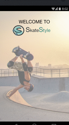
SkateStyle Skateboarding App
september 2018
the multi-device lifestyle experience
SkateStyle is a digital multi-device experience for the skateboarding community. I created the UX and UI for a connected mobile, smart watch, and a smart TV app, including an E-commerce store, wayfinding, skate games, and skill training features.


The Problem
The Stoner Skate Plaza in Los Angeles marked the starting point of this project. I was sitting in the skate park, taking a break of my unsuccessful attempts of learning a new trick, and thinking about the challenge for the upcoming quarter of my UX class: “(Re)Design something for anything you are interested in within the next 10 weeks. It has to include a minimum three different user interfaces.” So here I was sitting on the bench and puzzling my head over what I could do. At that point I began to understand that the answer was so obvious, right in front of my eyes.
My biggest challenges were:
-
How to design and test a sound experience within 10 weeks?
-
How to make best use of every device without overloading them with features?
-
How to keep a beginner's mindset when you would be a heavy user of your product?
The Journey

Devices:
Mobile
Smart Watch
Smart TV
Industries:
Fun Sports
Lifestyle
Gaming
E-Commerce
My Roles:
UX Research
UX Design
UI Design
My Team:
Individual Project
1. Ethnographic Research
Unintentionally, I started my qualitative research by talking to some talented skateboarders that were sitting next to me, while I was taking a break from the hot Californian sun. One of them was getting sponsored. I had just started skateboarding after a 7 year break so I wanted to see what had changed. I asked about brands, magazines, videos, and games and I realized that the skateboarding industry did not change significantly during the last years. But what I could observe, was that the kids on the skate park were using the cameras of their phones to record their newest tricks. The guys told me, that Instagram was the social platform, on which many semi-professionals shared their skills and tried to gain attention.
I decided to interview a broad spectrum of skaters, to get insights from many extremes in the whole skateboarding environment.
I wanted to speak to
-
Professionals or semi-professionals, who are the trendsetters on the skate parks, create their own video content, and earn somehow money with skateboarding.
-
Young rookies, who I thought might be a very important consumer group of a digital experience.
-
Passive observers, who could give me insights and broaden my perspective.
-
People from the business side of the industry, who know how to make money in the industry.
The skateboarding community is very easy going, open-minded, and friendly. So, I did not have a hard time to find interviewees. I did not even have to provide any rewards for my interviews. I brought some guiding questions to paper. In the end I just visited several skate parks, started conversations, and asked open questions about skateboarding. I wanted speak to the business side as well, so I went to skate shops and spoke to owners and employees, in order to get a better understanding of the buying behavior of skaters.


After my interviews, it was clear to me that the skateboarding community would be a very good fit for my project. I wanted to create apps where rookies and pros would have a platform to share their own content. I also wanted to include a way to share and easily find new skate spots. Additionally, I wanted to include a way to earn money with the apps.
2. Market & Competitor Analysis
One question remained open. Was this a viable market? I had to conduct quantitative research. Why was this market relatively unexplored? I wanted to know, if there was no real community app out there. Or if so, why was nobody using it? Where the skateboarders not willing to use digital experiences?
After a quick market research, I took a look at the competition in the digital environment. Unsurprisingly, I found many skateboarding games across devices. On the app stores there were some single feature apps with low download rates like skate park finder, that provided information about opening hours or trick simulators that showed how to perform a trick. I discovered many e-commerce stores. The number of downloads was relatively high, compared to the quality of the apps. Now I got really excited about my project.

3. Personas & Use Cases
The personas helped me focusing on different use cases for my applications. I listed various use cases, dismissed some of them, and sorted them to my personas in order of anticipated importance. I directly noticed that the common need for all of my personas was to follow and present pictures & video content within their community. Additionally, I needed to include features that would distinguish my experience from Instagram and Youtube.
I prioritized my personas:
-
Brian, the rookie, was my first persona. As potential influencer, content creator and potential heavy buyer of equipment, it seemed to be the right decision.
-
Stella, the beginner, was of second importance, as she was a follower, a potential buyer and a potential user for the next several years.
-
Tommy, the fan, was my third persona. I understood the importance of Tommy for the business side of my apps. The market volume of skate wear showed that there had to be a significant number of non-active fans. Still, the active skateboarders were my content creators, so they had to come first.
-
Alan, the pro, was of least importance of my personas. He might be a good marketing tool for my platform, but not a heavy user.
Now, it was easier to prioritize relevant use cases. After taking a look at my feature-value-list and listening to the interviews again, I sorted them in order of importance. Looking at the collection of use cases, I decided that I had to shorten the list of features. I searched for the most relevant features, which in combination formed a useful value-bundle. I decided to exclude video gaming, because it didn’t fit to other features and there was already enough competition out there. But I wanted to include some sort of gamification. The app should attract a user base with very helpful use cases and earn money with an included skate shop. Some use cases could also be integrated into other devices.


4. Taxonomy and User Flows
Understanding my personas’ way of solving their use cases and understanding how content should be sorted was of highest priority for this project. From the interviews I knew, that three devices were relevant. A mobile app, a smart watch app, and a smart TV app. These devices were more or less useful for the specific use cases. I listed the personas, devices, and use cases and created sitemaps and user flows for the different devices.
But I had to be careful not to design for myself, but for my personas. A closed card sorting seemed to be the right choice to find out how my users think about structuring the experiences. So, I wrote features and content inventory on cards and asked three skateboarders for help.
I started sketching with pen and paper before I used Sketch to produce digital sitemaps. Three levels for the mobile app were enough. The emphasis should lie on user flows. I created three sketches of different versions of a home screen and added some basic user flows. Especially for the smart watch and the smart TV app use cases should be solved as fast as possible. I sketched out all the different use cases before I thought about grids and device types of smart watches and smart TVs.


5. Designing and Prototyping
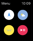
The card sorting was a real eye-opener. Besides identifying patterns, how my mobile experience should be structured, I received some good indication how the different device types could be used naturally and which features I should leave out, to avoid overload. Very clearly, the mobile app was the most feature rich application, where the smart watch app was - like the smart TV app - a very useful device for instantly consume videos, stats, and navigation. In addition to that, it added a body sensor to the whole experience that I could use to add user data to the training section.
I first built a low-fidelity black and white version for the mobile app in Sketch, because I wanted to conduct user testing without distracting them with pictures and colors. I built a prototype and used InVision to prepare a first user testing. I also built a high-fidelity version of my smart watch app, because I wanted to get a general feedback about a smart watch app for skating.


6. User Testing and Iteration


I used the same interviewees as for my initial research. I first performed a CTA testing for the mobile app, because I wanted to see if the experiences were self-explanatory. Most of the mobile app seemed very intuitional, but some things needed to be changed. The concept about the battle mode was unclear, where users could compete with each other for based based on their skate skills. To make the game more self-exploratory, I changed its name into SKATE, a commonly known and played game by skateboarders in the skateparks. I dismissed the search bar and applied some other changes to the design.
After applying these changes, I built a high-fidelity version of for all three apps. It was time for an RP testing to see if the use cases were fulfilled in an appropriate time and with a very high success rate. I also A/B tested the two color schemes that I had in mind. I used powerful colors and a playful design for the logo. It should fit to the skateboard designs and graffiti that you can find at every skate parks. The logo should visualize motion and affiliate with skate park obstacles. I used the material design color picker to support my choices with matching colors.
The usability testing of the high-fidelity prototype went very well. The users were able to archive the goals of the use cases in a very fast time. The A/B testing of the look and feel resulted in a win for the more moderate green version of the logo. The smart watch design and the TV design were rated positively as good additions to the mobile app. It remained open, if they would be interesting as a standalone products.
The Result
There was no intention to develop this product in the first place. Still, I am happy to have a ready to go prototype for a product idea and I am very confident in it. If you are interested in participating in this project, please reach out to me. I would be happy to talk to you about details.
What I learned from this experience:
-
I should never design for myself, but always be open for constructive feedback and ask the user to give me the answers to my questions.
-
User research and testing can consume the most time of a project. But done correctly and with reasonable design steps in between, the success rate of the whole experience will be higher and it will safe you time lost for not useful designs.
-
Adding and combining different devices to a digital ecosystem can create many additional opportunities. They can compliment each other and they have their very unique strengths, weaknesses, and use cases that have to be taken into consideration very well.